

BLOG

Beer Badges: Designing for Oval Brewing Company
Designing beer badges
I started up a part-time job this year with Battinelli Photo and Design. It a small business in my town run by a great photographer that had taken on some graphic design work and needed some help, so I was happy to come on board to assist.
This was my first big task for him. Oval Brewing Company, based right here in Plattsburgh, NY, came to us a few times needing small logos called “badges” to represent new beers they had created. They were small, simple images that would be put on each label for each specific brew. They had several already, so it was my job to come up with a few new designs that matched the style of these pre-existing ones.

Some examples of pre-existing badges. I would have to match their style with my new ones.
My first job was a badge for a light IPA. In my first meeting with the boss, he mentioned “maybe a hop light bulb or something...” and I really liked that idea. I ran with it and designed this badge first. Thankfully, the boss loved it too.

My first try at the ‘Light’ badge, literally making a hop light.
We went through a few iterations of different bulb ends, with glow lines and without, changing the light/dark relationship, until we got here.

Here We had decided to make it dark for more impact. The boss really wanted to see some bulb threads, but it never looked right to me.
I really liked the visible filament inside, but the client opted for their current hop logo in place of my hop, so it had to go. This version is the one they went ahead with.

Finished ‘Oval Light’ logo as it appears on their website.
Next up, the client needed a badge for a sour IPA. This one seemed pretty vague at first. Like...how do you represent the concept of sour? I started to fall back on packaging for sour candy, with lots of pop and explosion imagery. My best early idea was an atomic explosion in a beer glass. But before I worked on this too long, I was told the client had mentioned wanting something more psychedelic, like swirls and bubbles. I could work with that.
I first tried working directly in Illustrator, but trying to freehand organic shapes directly in the program with a mouse was too difficult. I had to revert to pencil and paper to work out a starting place, which worked great! A few sketches later I had zeroed in on something I liked: a black and white swirling beer glass with an explosively foaming head.

Where it started. Never doubt the power of a plain envelope and a stubby pencil.
I quickly translated this over to Illustrator and had a design ready for the client. And the best part, he loved it! It went ahead exactly as I had designed it.

Finished ‘Sour IPA’ badge, as it was approved and published.
The last example today was for a new brew called “Mind Games”, a maple beer that starts off tasting way too sweet but ends with a mellow finish. I loved working on this one, my mind swirling with all the imagery I could pull from. I had a few ideas, like a maple leaf puzzle, maybe a maple leaf maze, but the one I really liked was a head silhouette with an interabang. It just seemed like such a succinct and eye-catching image to depict the drinker’s experience.

My personal favorite badge for ‘Mind Games’. It ultimately went unused.
I put a lot of time into this little guy, but the client was looking for something else that emphasized the maple flavor. My boss came up with a brain exploding maple leaves, which the client much preferred. The last change the client wanted was to have the brain in a profile view, which I helped with. This was the final version that was incorporated onto printed cans.

Final ‘Brain Games’ logo
So there it is. Some designs start fully formed, some designs take work shopping to get just right, and all of it was a lot of fun. I’ll be sure to include another post if I ever get to do more design work for them.
And be sure to check out Oval Brewing Company. It’s a small, independently run brewery right here in upstate New York. Check out their website here, and visit their location if you ever have the chance.
Anyways, thanks for reading. I’ll see you next time!

A Tale of Two Bookmarks
How a little hard work brought in a commission.
Late in 2022, I had my first solo art exhibition at a local library. I wanted to make the most of it, so I was looking for something I could use to show my appreciation to them for hosting. I saw that one of those online printing sites offered custom printed bookmarks, and it seemed like a perfect fit.
I went ahead and took photos of the library, a cute little old-fashioned building, and worked on pencil roughs first. I wanted to feature a large illustration of the building itself, making it in this pen and watercolor style I had found through another drawing.

A mixture of pen work with watercolor over top, I loved the textured look this technique had.
When I found a design I liked, I started working on the final illustration. Working on watercolor paper, I penciled, penned, and colored the drawing over a few hours, then ran it through the scanner.

I based my final design on this pencil rough.
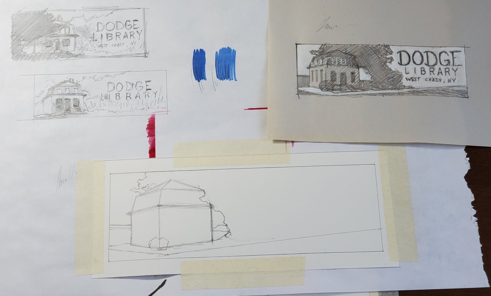
The final illustration begins.

The finished illustration, with blank space for type.
I digitally added the text on the right and now realized I should have added some edge run-off on the drawing. I made it work anyway. I worked up a design for the back with some simple info and a smaller version of the drawing, adding a color pulled from the original. It looked good to me, so I sent it off to the printer.

Finished Dodge Library bookmark, front and back.
The staff of the library loved it, and they took a stack of them to give to new members when they visited. I would say it was a success.
When I had another art exhibition at the Peru Library, I showed them one of the Dodge Bookmarks. I figured they might be interested in one of their own. Sure enough, a few days later they reached out to say yes, they want one! And this time, it wasn’t just volunteer work. With that, I was off and running.

Peru Free Library bookmark rough.

Final illustration, penned. I added a bleed this time, along with subtle edge guides.

Color is added. I used a text layover to plan the whitespace.

The final bookmark front and back. The smoke from the chimney was a special request from the client.
With that, I had two illustrations under my belt. The art exhibitions had pretty good turn outs too, so successes all around!

Scrub-a-dub-dub: Creating an Identity for Cleaning Products
Creating an identity for cleaning products.
For as long as I can remember, my Grandma had been crocheting. From sweaters, to blankets, to baby clothes, she made all manner of things with yarn. And a few times a year, we would pack up her creations and sell them at local craft fairs. One of her best sellers were always these small, round, unassuming kitchen scrubbers, dubbed “Scrubbies”, that she crocheted not with yarn, but from strips of plastic netting. They’re a very strange thing to describe, but they work really well, and they always sell fast.
When she passed away a few years ago, it was up to the rest of us to continue her legacy and make more scrubbies. Between all of us in the family, a lot of Scrubbies still get made and sold every year. So many in fact, that we’ve started selling them in local stores. At first, they were sold with no sign and no indication of what they were for, just marked with a price. That didn’t cut it for me, so I decided to make a sign worthy of their legacy, that would hopefully tell people what they were while subtly giving them some history.
I went into this wanting to impart buyers with my feelings on them: a helpful little item that had seemingly been around forever. So I drew on old advertisements you might have seen in magazines from the 40’s or 50’s for similar cleaning products. Simple, bold graphics that look like they’re from another era, with plenty of text to communicate just what these things are.
I worked up a round shape that would give their name a prominent banner on the sign, while allowing me to put a photo of them directly under it. It also mimicked their own shape, drawing the whole thing together. I included “Grandma’s” in the name, giving them a sentimental edge while allowing my own Grandma to continue on with them. I included a list of what they can be used on, giving customers an idea of possible uses. The whole thing is laid out on top of a white vertical banner with pale yellow around the edge. I found a nice “vintage” looking crochet hook illustration to emphasize their handmade nature and give a little more visual interest. Lastly I added a textured layover on the entire design, bringing down the colors and giving it a warm patina.


Despite the low resolution, you get the idea.
It was printed on card stock and taped to the sign of this wire basket display we had on hand. It all came together to feel like something out of time, ready to last through your cleaning needs for generations to come. I couldn’t be happier with it, and I like to think Grandma would be proud.
Forging with Plastic
It all begins with an idea.
My friends are all great people, and they’re all nerdy in their own ways. Some love trading card games, some love fantasy fiction, and one of them loves cooking. He’s all about it, and high fantasy too, so it’s no surprise he loved the Netflix show “Delicious in Dungeon”. For those that aren’t familiar (like myself), it’s an animated show about a motley group of people who help an adventurer find his missing sister. She’s been kidnapped and dragged deep into an underground dungeon made up of several levels, each with its own gargantuan monster. As we all know, fighting monsters is hard, so it leaves our adventurers with big appetites afterwards. Luckily they meet Senshi, a kindly chef living inside the dungeon who not only helps guide them and slices up monsters, he even cooks the monsters into delicious meals for them! It’s a lot of fun, and they even give some real world cooking advice while they’re at it.
The chef character Senshi happens to bare a striking resemblence to my chef friend, so he wanted to dress up as him at for a local RenFair. He had found someone selling a 3D printable file of the character’s distinctive helmet, but no one to actually make it. Knowing I have a 3D printer, he enlisted my help. Much like the show’s characters, I embarked on a lengthy quest that would take me to places I hadn’t imagined were possible.
It started with purchasing the 3D file, which luckily came sliced into parts for smaller printers like mine. It consisted of four parts for the main helmet dome, two halves for the neck guard, and two separate horns. It also included a fit check piece, something like a thin headband, which I used on my friend. It was a little too small for his head, so I had to enlarge the whole helmet by about 10%.
In bringing all the individual pieces into the Cura slicing program, I found the neck guard halves were still too big for my printer bed. I had to cut these into two pieces each before printing. This might be the time most folks would load the pieces into a fancy 3D program like Blender and perform a cut that way, but I couldn’t figure out how to make that work. I instead went to TinkerCAD, a free to use browser-based 3D program, to make the cut. All I had to do was load two copies of each piece into a new TinkerCAD file. This allowed me to line up the two identical copies over one another, and use the “hole” function to remove the opposite halves of each. It might be a little round-about, but the program didn’t have any problem doing the job and it takes a lot less loading time on my laptop than a program like Blender does.

After that I got the pieces printing. I hadn’t printed something this big and complex before, much less had to glue it together and bring it to finish, so I kept waiting for some issue to spring up I hadn’t even considered at the start. Nontheless, the printing gods must have been on my side that day, as the pieces came out great.
(Pieces on printer bed)
I took this as a good sign and ran ahead with printing everything out. After a few days I had the entire thing printed and taped together, and it was already looking pretty good.
As I started gluing I began to see a problem I hadn’t accounted for. The pieces were thin with very flat edges and, being standard PLA, they were quite flexible. I had to glue this thing together into something that would take being worn and handled. I used E6000 to glue the individual pieces together, as my research had told me to do, but this was a little flexible also. The result was a helmet that, when the two sides were squeezed in on, would stretch apart slightly at the seams. It seemed solid enough for wearing, but I’m sure it wouldn’t take too many drops before the pieces began ripping themselves apart.
To give the seams a little more strength, I cut apart a plastic ketchup bottle into thin strips of plastic and glued them along the seams from the inside. It wasn’t a lot, but I hoped they would work with the glue to give the pieces a little more staying power. It did seem to make it stronger overall, although the seams on the brim edges were still separating when pushed on.
The neck guard was by far the worst offender, with three seams that were very ugly and prone to separating. I tried using filler to hide them, but unlike all the other materials it isn’t flexible. It ended up just cracking and mostly flaking off, especially when sanded.
My justification for this (as time was running short and I couldn’t do this all over) was that my friend wanted it to be a beat up helmet anyway. Maybe it’s damage sustained in battle and repaired in less than ideal circumstances. Maybe it’s something I can cover with paint. My biggest takeaway was that, should I ever do this again, I need to engineer some flanges, or nesting connections, or some other means of connecting these pieces together beyond gluing two thin edges together.
Anyway, that’s it for Part 1. Next up is Part 2 where I’ll be finishing painting.